
Color in Comics: Using Color with Purpose

Last week, I was listening to Brad and Dave’s Comic Lab episode, “Color Commentary - Can You Succeed With a Black-and-White Comic?” Listen Here!
It was one of those episodes where a simple question opens a bigger door: Is color necessary in comics?
My short answer: Absolutely not.
You can make a masterful comic in black and white. Two immediate examples come to mind:
• Monsters by Barry Windsor-Smith
• Black Hole by Charles Burns
Both rely on phenomenal linework, texture, and storytelling. They don’t need color because the artistic choices are intentional.
And that’s really the point.
Whether you’re working in full color, black and white, or grayscale, I believe the approach should be purposeful. Thoughtful. Designed.
And for me, that philosophy comes from thinking about comics not just as art, but as Visual Communication, using concepts, mood, pacing, and design principles to tell the story as effectively as possible.
When I create a comic, color theory is never an afterthought. It’s part of the architecture.
Below are a few examples from Hellscape Americana, and how I used color to shape each story’s identity.
⸻
Exhibit A: “Some Assembly Required”
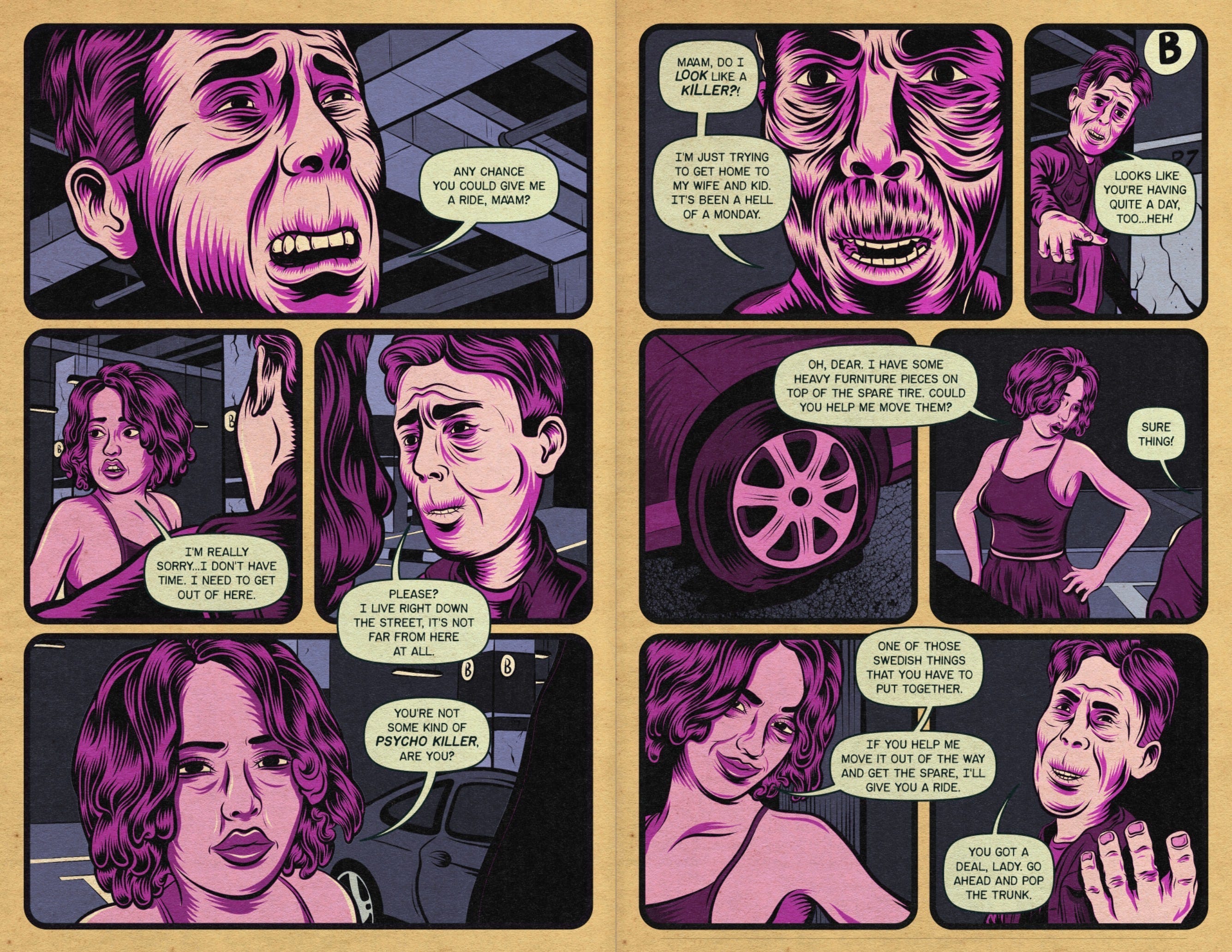
Color Palette
• Purples, violets, desaturated blues
• Light, dirty green for word balloons and SFX
• Mid-to-dark values with bright highlights where needed
• Cool overall temperature, contrasted with warm, worn paper texture
Why These Colors?
The purples and pinks first read as “feminine,” nudging the reader toward one assumption about the main character…Before the story flips that expectation. It’s a palette that helps the twist land.
The bluish garage lighting adds a cold, industrial mood, while contrasting nicely with the character’s skin tones so she remains the visual focal point.
And that pale, dirty green for SFX and balloons?
It’s intentional discomfort. A slight clash that tells you something is off in this world.
It also guides the eye from beat to beat.
Overall Effect
The colors feel uncanny, uneasy, and subtly wrong. Hinting that the story’s reality is unstable long before the reveal.
⸻
Exhibit B: “Trackman”
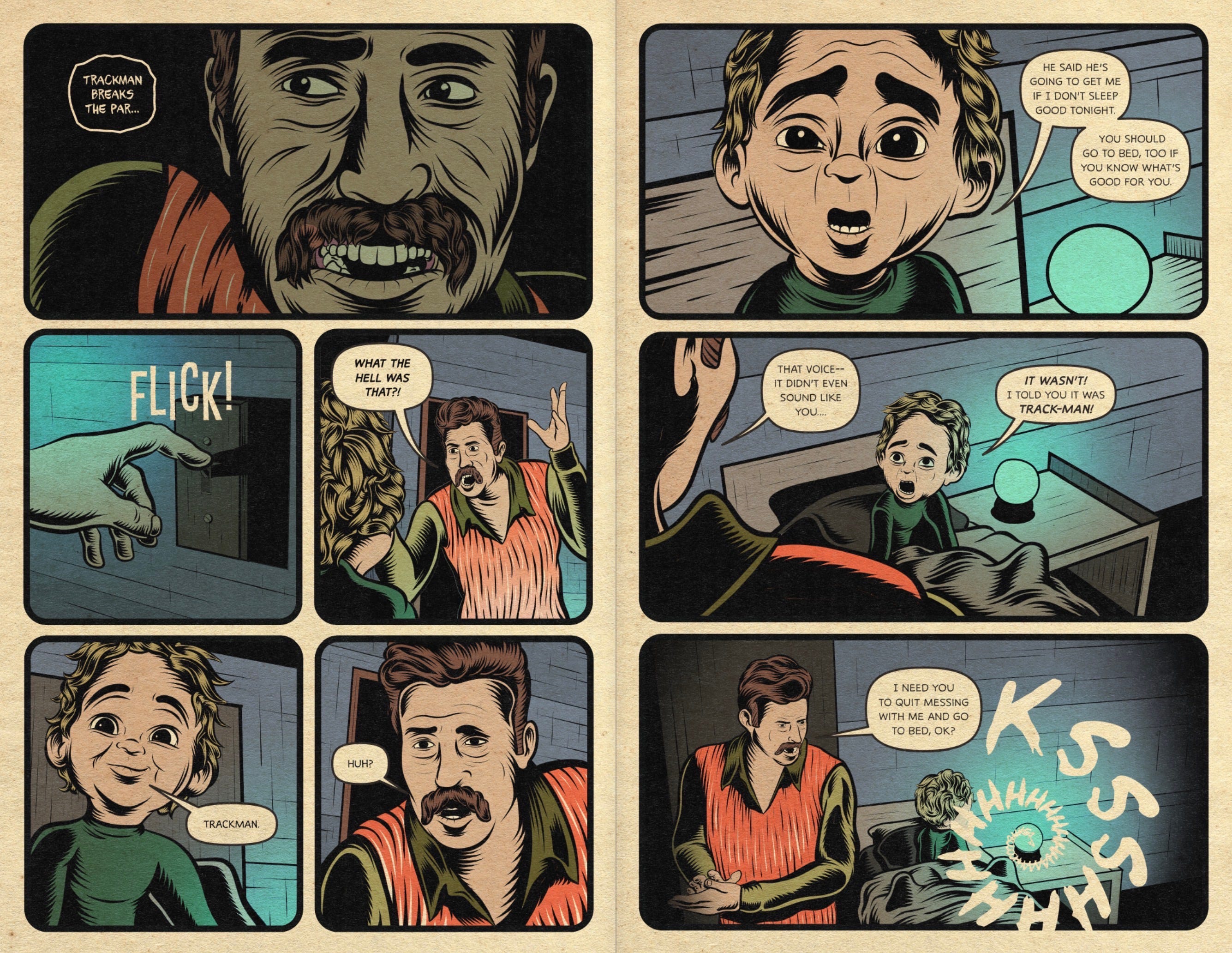
Color Palette
• Teal/cyan shadows and walls
• Earthy oranges and browns for clothing
• Muted, naturalistic skin tones
• Strong directional lighting
• Complementary contrast (orange vs. teal)
Color Theory at Work
The teal shadows create a cold, technological unease. Perfect for a story where smart devices and the supernatural blur together.
The father’s warm oranges set him apart from his environment, grounding him as the “human anchor.”
The child, meanwhile, sits in cooler tones: Calm, connected, almost absorbed by the tech around him.
And the minty glow of the smart speaker?
It’s the only neon hue in the room, instantly marking it as otherworldly.
Overall Effect
A horror palette rooted in the uncanny intersection of technology and the supernatural. Color becomes part of the tension.
⸻
Exhibit C: “Petland”
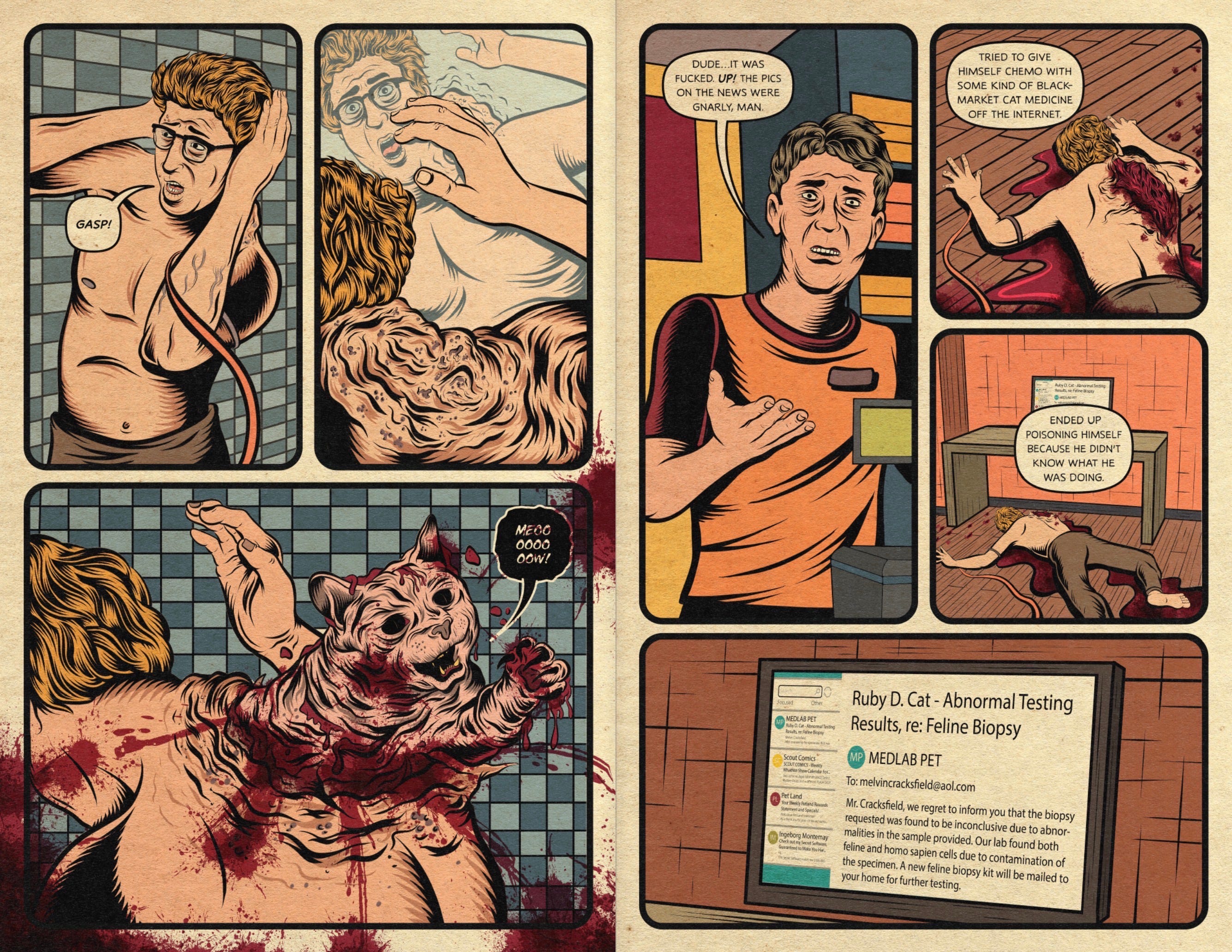
Color Palette
• Sickly greens, raw reds, grays, tans
• Muted blues in bathroom tiles
• Mostly desaturated except for the vivid reds
• Gritty textures with warm paper tone
Color Theory at Work
The palette intentionally feels unhealthy—jaundiced yellows, murky browns, cold clinical blues. It primes the reader for decay and body horror.
And then there’s the red.
Red is the storytelling color here. Because everything else is muted, the reds slice through the page:
• The wounds
• The splatter
• The cat exploding from the man’s back
The pinkish tones shared by man and cat subtly foreshadow the contaminated biopsy twist.
Overall Effect
A sick, oppressive palette that makes the gore land harder than if everything were loud and saturated. The color hurts…In a good way.
⸻
But What About Grayscale?
Each story in Hellscape Americana has a distinct color identity: Feminine purples, tech-horror teals, medical-horror greens.
And yet the whole book still feels unified.
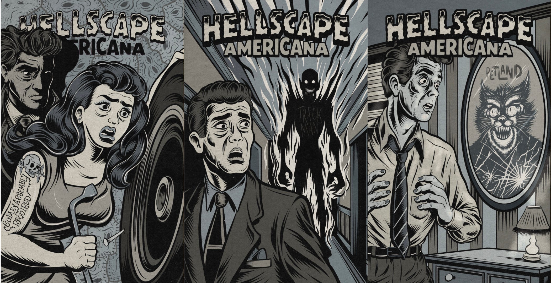
That cohesion comes from a deliberate choice: the title pages are grayscale. Even though the title pages are rendered in grayscale, they aren’t confined to a single temperature. Each illustration is built from a deliberate mix of warm and cool grays, which adds subtle depth and emotional nuance. The warm grays echo the aged paper texture and give the artwork an organic, pulp-inspired feel, while the cool grays add atmosphere, tension, and a quiet sense of unease. By placing these temperatures against each other, the grayscale pages gain natural emphasis and contrast—warm tones push elements forward, cool tones recede, and the eye is guided to the most important shapes and expressions. This temperature contrast keeps the pages from feeling flat and turns “just grayscale” into a rich, dimensional tool. In the end, the blend of warm and cool values not only unifies the anthology but also creates a visual hierarchy that subtly prepares the reader for the tone of the story to come.
These grayscale spreads serve several purposes:
1. A Visual Breather Between Color Worlds
Each story shifts tone and palette. Without a buffer, the transition could feel abrupt.
The grayscale pages work like a cinematic fade-to-black, giving readers a moment to reset before entering the next “color reality.”
2. A Shared Visual Language
This pattern:
grayscale to full-color world to grayscale to next world
creates a rhythm the reader subconsciously recognizes. It makes the anthology feel curated rather than chaotic.
3. Emphasizing Craft Over Color
By stripping away hue on the title pages, the reader focuses on:
• linework
• lettering
• texture
• thematic elements
It reveals the connective tissue beneath the color choices.
In Short
The grayscale pages unify the book.
They act as anchors…Quiet, neutral, and grounding, so that each story’s color palette can be bold and specific without overwhelming the whole.
⸻
Final Thoughts
Color in comics isn’t mandatory. Plenty of masterpieces prove that.
But when used intentionally, color becomes another storytelling tool. One that is just as important as pacing, line, or layout.
For me, color is a way to:
• set mood
• guide the eye
• manipulate emotion
• mislead or reframe
• amplify impact
• unify disparate narratives
Whether you’re working in full color or shades of gray, the important thing is the same: use it with purpose.